apple wallet card sharing concept
people lend each other their cards all the time and there is no approved way to do it. your bank says not to. the law says a charge you agreed to is not fraud, so whatever gets bought is yours. nobody writes down what you actually agreed to, and you cannot take it back.
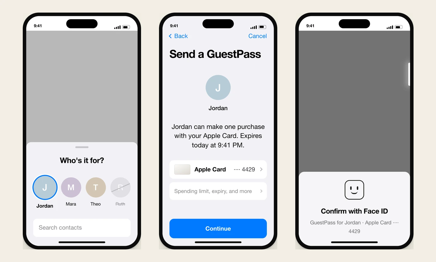
this is a concept for the missing option. you open wallet, tap your card, tap send a guestpass, pick a person, and confirm with face id the same way you confirm a purchase. a temporary card shows up in their wallet with a dashed edge and an expiry time. they tap to pay with it once. then it is spent, and you get a note saying which store, how much, and when. none of this was built, it has nothing to do with apple, and every name and number on the screens is made up.
at a glance
client. none. self-directed, and nothing was built.
surface. a concept feature for apple wallet on iOS.
the idea. lend the ability to pay. the money stays yours.
the mechanism. single use and instant revocation, not a spending limit.
the hard line. the map shows the store. it never shows the person.
delivered. 15 renders, a hosted case with two prototypes, a rationale, a build spec.
the boundary. no relationship to apple. invented data, and stand in card art.
a normal thing with no approved way to do it
it started as two sentences i wrote down before i knew what the product was. like a valet mode for your digital cards. like a digital version of handing someone your card so they can go pick up food for you.
both of those are physical and social. neither one is financial. that turned out to matter more than anything else i decided later, because every time i got stuck i asked what happens when somebody hands you their actual card, and the answer was usually right. single use came from there. so did the receipt. so did being able to take it back.
every workaround people use now is worse than the problem. sending cash gives the money away for good. adding someone as an authorized user is a credit reported commitment for a twelve dollar errand. texting a photo of your card is exactly as bad as it sounds.
the object, which everything else reads from
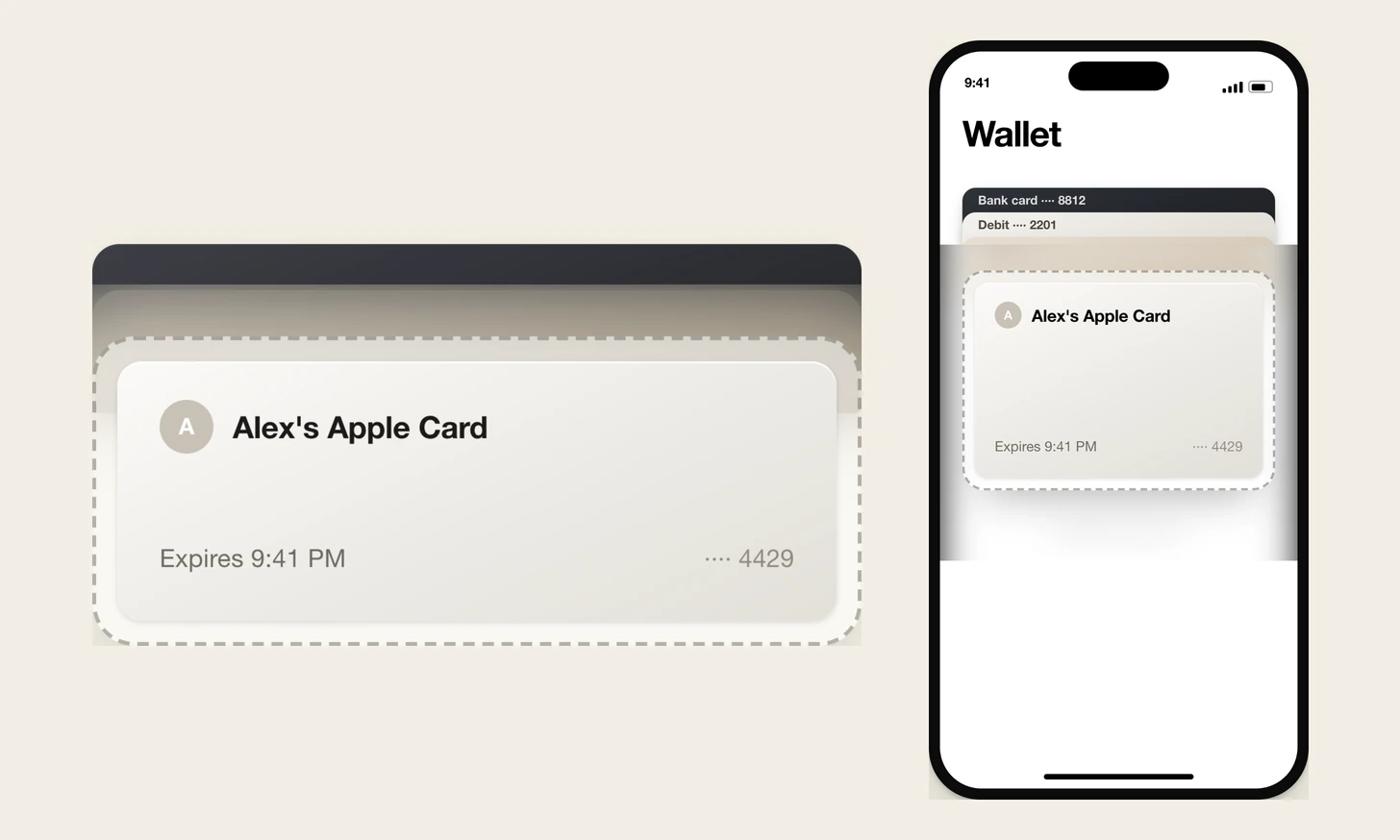
this is the most important visual decision in it. get it wrong and the rest misreads. if it looks like a normal card, the person holding it believes they have a card. they do not. they have a narrow permission that ends.
i named the reference myself. chatgpt marks a temporary chat with a dotted bubble instead of a solid one, so it could be something like that but apple-esque. a broken outline means impermanent. drawn in the glass material the system already uses, that becomes a sleeve holding a card that is obviously not yours.
three things it has to say at a glance: whose card it is, that it is temporary, and when it ends. three things it must never do: show a live countdown, show a dollar amount on the face, or look like a broken card. an amount reads as a balance and a balance reads as cash. a grayed out card already means something to people, and what it means is declined.
the version i threw out desaturated the real card face and pinned an amber strip to the top. readable, obviously unusual, and wrong, because looking weak and being temporary are two different messages. and one rule that is easy to miss: the dashed edge only reads as temporary next to solid edges, so the borrowed card never gets shown on its own. it always sits in a stack.
four taps and no decisions
sending is a card, a person, continue, and face id. every option lives behind one collapsed row, and every one of them already has a sensible answer filled in.
there is no verification screen, and there should not be one. i flagged early that we would need a way to prove the sender owns the card. the instinct was right and the conclusion was wrong. a card cannot get into wallet without the bank checking who you are first, so holding a card and passing face id is the proof. the research deleted a screen instead of adding one.
continue leads into face id, and then you get the same checkmark you get after a purchase. that moment carries the ownership proof and costs nothing to learn, because people already do it several times a week.
the reversal that moved the whole thing
i had already agreed to a design where the owner sets a dollar limit before sending. then i pictured a real conversation and it fell over. someone asks to use your card for thirty bucks, you say sure and send it, and the total with tax is $37.52.
that one example kills the required limit. thirty is a conversational number, not a budget. a required cap would decline a purchase both people wanted, which means the control causes the exact failure it exists to prevent.
the second half was worse for the original design. it becomes a big mechanical process, which stops people from wanting to use it at all. a feature nobody opens has no safety properties. handing over a plastic card takes two seconds and zero decisions, so a forty second digital version loses to the status quo every time, and then none of the safety work matters.
so the limit became optional, and the thing that made it defensible to me is this. single use and instant revocation are the safety mechanism. the spending limit never was. hold it against what it replaces. a plastic card has no cap, no expiry, no store restriction, no receipt, no record, and no way to take it back. one of these with every option turned off still has all six.
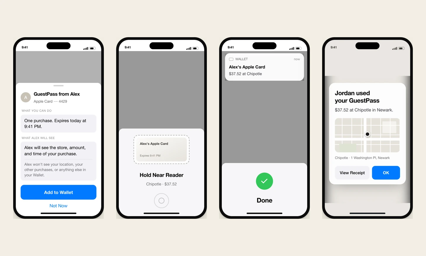
the tap, and the receipt after it
the person you sent it to gets a sheet, reads what you will be able to see, and taps add to wallet. that phrase already exists in the operating system and it is literally what the button does. nothing installs without them saying yes.
sending is something you do. receiving is something that happens to you. so the send flow takes the whole screen and the receive flow comes up as a sheet over whatever they were already doing. it was backwards for a while, and both screens had the same footprint, which meant the difference between the two roles was not being said at all.
after the purchase the owner gets a note with the store, the amount, the time, and a map of where it happened. the buttons are view receipt and ok. an earlier version had a not me button, which turns a normal purchase into a security incident, and disputing a charge is a conversation with your bank anyway.
why every clock came off
instead of a countdown, the card says Expires 9:41 PM. a countdown and a timestamp carry the same information and produce opposite feelings. one is a fact and the other is a deadline. i only caught it by picturing a specific scene, which is the method i would recommend to anybody: test the design against a real evening rather than against a principle. a dinner your brother is paying for should not turn into a race to pay before the timer runs out.
the rule i pulled out of it is that if the user cannot hurry, do not show them a clock. that killed progress bars, three uses left, and depleting balances too.
i kept one exception for a long time. after the owner approves a raise, the retry window used to show ninety seconds ticking down, and i justified it because the urgency there is real. late on i took it off anyway and the screen got better. somebody standing at a register with people behind them does not need a clock telling them to hurry.
where the person goes
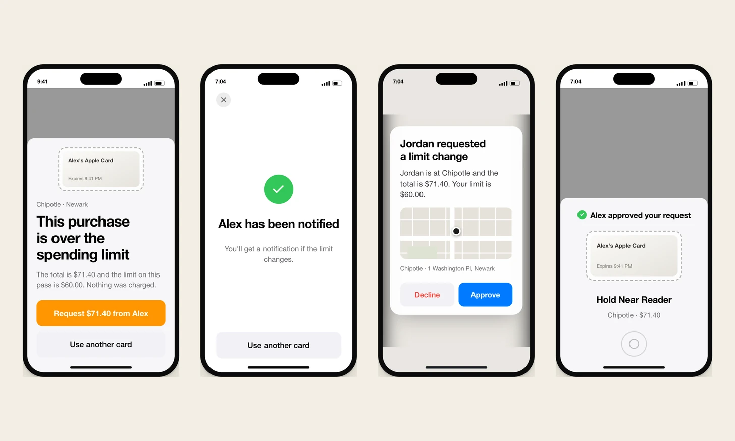
my first instinct was to ping the owner to approve every tap. that cannot work. the design assumes a card authorization at a terminal finishes in a second or two, which is the one number the whole structure rests on and the one i would check first with a payments team. the card would decline before the owner’s phone finished waking up, and the person at the register would be stranded any time the owner was asleep or out of signal.
the fix was not to delete that idea. it was to move it. collect the owner’s judgment before the tap, as a set of rules the bank checks by itself at machine speed. then, only when a charge busts those rules, the request fires with a real store, a real amount and a map. the person is in the loop. they are just never inside the two second window.
the general version: move the human off the critical path and ask them before or after. if a screen puts a human decision inside a tap to approve moment, it is wrong.
there is a second consequence i like. the rules the bank enforces are exactly the controls the owner sees when setting up, so the interface and the security model are the same object. they cannot drift apart.
the line i will not cross
research on money apps and controlling relationships is not ambiguous. shared spending visibility gets weaponized. so the map in the owner’s note shows where the purchase happened, taken from the transaction record. it never shows where the person is, and i want that written down so nobody rebuilds it as live location in six months.
the rest of the guardrails exist for the same reason. the borrower can end a pass any time without giving a reason, which is a right and not a courtesy. every pass expires, so none of them can quietly turn into permanent monitoring. they read exactly what the owner will see before they accept. anyone under eighteen routes to the family products, which were built for that.
there is also no way to ask for one. that inverts who is doing the asking, and unprompted requests for money are a documented tactic in coercive control. it is left out on purpose. permanently forbidden: any control that watches where a person is. a limit on the kind of store does the same legitimate job without following anybody.
the empty corner, and a ceiling borrowed from banks
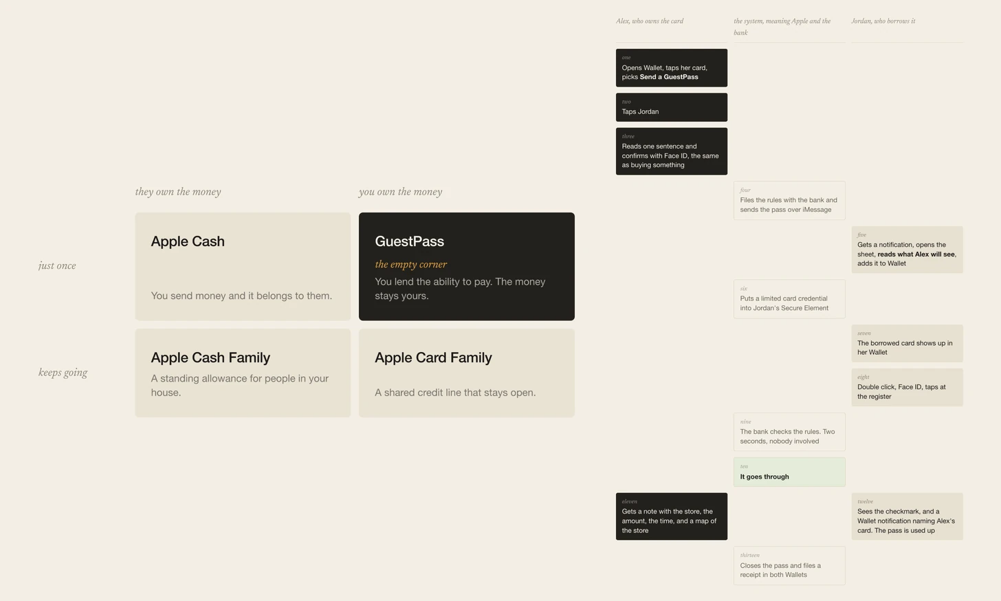
before drawing anything i had to check whether this collides with something that already exists. put the money sharing products on two axes, who ends up owning the money and whether it happens once or keeps going, and the answer draws itself. three of the four corners already ship. this is the empty one, which makes it additive rather than competitive. that is a much better argument than convenience.
three rules keep them apart, and they are built into the plumbing rather than written as policy. it never turns into a balance, with nothing to cash out and nothing left over. it can only pay a store and never a person, so it is structurally incapable of doing the peer to peer job. and repeat use is a hand off rather than a fight: four passes to the same person in a month and wallet suggests the family product instead.
taking the required limit off left nothing between a three tap send and one four thousand dollar purchase. technically authorized. almost certainly not intended. instead of reasoning out the right number i reached for a control people already live with, which is the transfer ceiling their bank already sets. a ceiling borrowed from banking needs no explaining and produces no surprise when it fires, because everybody has hit one.
two ceilings, not one. a per purchase cap on its own falls apart if you send ten passes just under it, so a rolling daily total is what actually closes the hole. real banks pair them anyway. and the number is inherited rather than invented, so it scales by itself between a student debit card and a premium card. crossing one routes into the request flow that already exists, so it cost zero new screens and one new line of copy. the general idea: before designing a new safety control, check whether a system the user already trusts solves the same problem, and borrow its shape.
what is open, and what this is not
sixteen questions have no settled answer. the three i think about most: should the daily ceiling be visible anywhere before it fires, what happens the first time somebody uses one in another country where currency movement can push a settled amount over a limit that was fine at authorization, and should a person ever be able to ask for one given how easily that gets twisted.
and the one i keep coming back to, which is a product question rather than a design question. if six of these go to the same person in a month, is that the feature working, or is wallet quietly telling me those two people needed something else.
three of them are about whether the design does what i think it does, and none has been tested. whether the dashed edge actually reads as temporary, since it is a pattern borrowed from a different product in a different context. whether the expiry time is genuinely calmer than a countdown, where the reasoning is sound and the effect size is unknown. and whether being told what the owner will see makes people more willing to accept it or less.
now the boundaries, which matter more than any of that. nothing here was built and nobody asked for it. it has no relationship to apple, who did not commission it, review it, or see it. the card faces are generic stand ins rather than anybody’s real artwork, and every name, store and dollar figure on the screens is invented. the whole thing also depends on card issuers agreeing to something they do not do today, which is the first thing that would have to be true.
the prototypes
you can open the full case, opens in a new tab, with both prototypes in it.
next up is chellbook, or go back to product designs.