jellybox
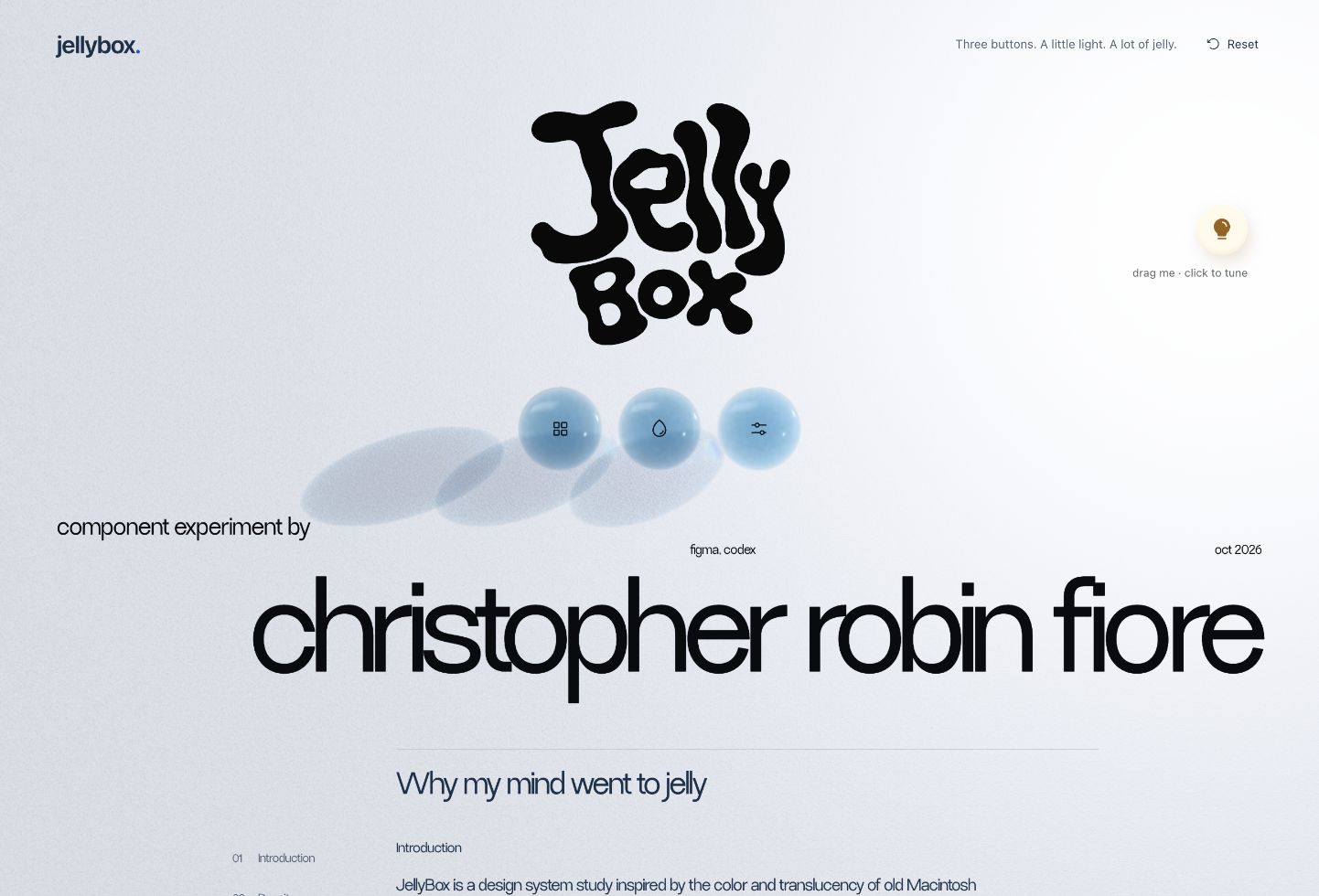
i wanted the material of an interface to help explain its structure. jellybox is a working study of three buttons that take turns becoming part of a shared window, then gather back into the trio.
at a glance
my role. design, interaction, motion and implementation.
tools. figma, codex, react, webgl and spectral.js.
scope. three tools for exploring motion, color and material, with an adjustable light.
why jelly
the colorful translucency of old macintosh interfaces and frutiger aero gave me the starting point. i wanted to carry that energy into a system where the material has a job: explaining hierarchy, grouping, selection and change.
i began with separate components, then narrowed the experiment to three buttons. that smaller scope let me work on how they relate to each other before trying to build a larger workspace.
density becomes structure
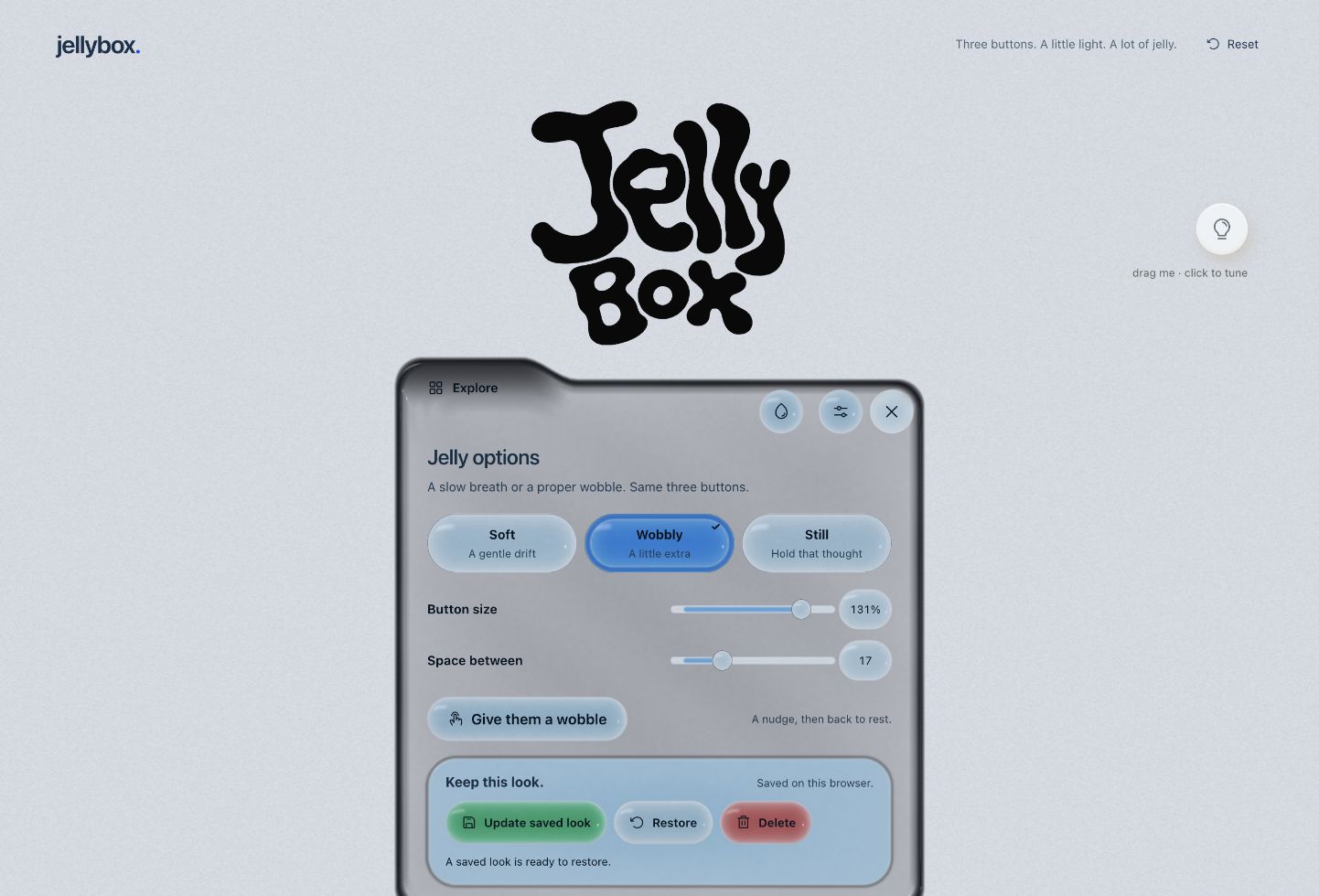
a border can be a denser part of the same material. the window gathers into a firmer edge and thins across its reading area. inside it, shape & optics expands from a compact pill into a folder for extra controls, then gathers back.
the material changes its edge, depth and lighting together. labels and values stay steady. that separation lets the surface be expressive while the controls remain predictable.
motion explains ownership
opening a tool turns its button into a tab on the window’s top-left edge. switching tools lets that tab withdraw while the next takes its place. closing gathers the window back into the trio.
i shaped the stretch, pinch and settling with custom curves and damped motion. interrupted transitions continue from their current state. the jelly can move toward the cursor, but its actual click target stays anchored.
color and light share the material
spectral.js supplies the pigment-inspired mixing path. the controls and window follow the same precomputed color samples, including when a palette changes during a transition. a preview comes before applying a palette; labels, checks and focus indicators also communicate the choice.
dragging the bulb changes highlights, colored casts and transmitted light. its brightness, height, softness and warmth are adjustable. i keep those effects quieter across reading areas, and the interface still needs to make sense with the light off.
expression needs a stable control
sliders keep a short rail, label and value visible, then their material gathers on approach or focus. value bubbles can be dragged, with shift for finer adjustment and escape to cancel. keyboard input, visible focus and reduced-motion support are part of the implementation.
these are working interactions. the larger design question is whether density, motion and light help someone understand where they are and what changed.
what the study establishes
the prototype gives me one place to develop the rules and inspect their behavior together. its geometry, lighting and settling are authored real-time approximations; spectral.js describes pigment mixing. this is not a physically validated jelly simulation.
i have not established a usability benefit. testing whether the material helps people follow grouping, ownership and change is the next question. larger workspaces are a direction for the system to grow.
the experiment
you can open the working demo, opens in a new tab, including my full design story, or inspect the source on github, opens in a new tab.
next up is apple wallet card sharing concept, or go back to product designs.