mfny concentrates
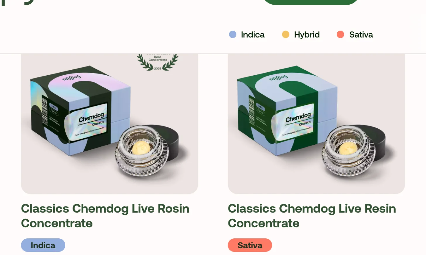
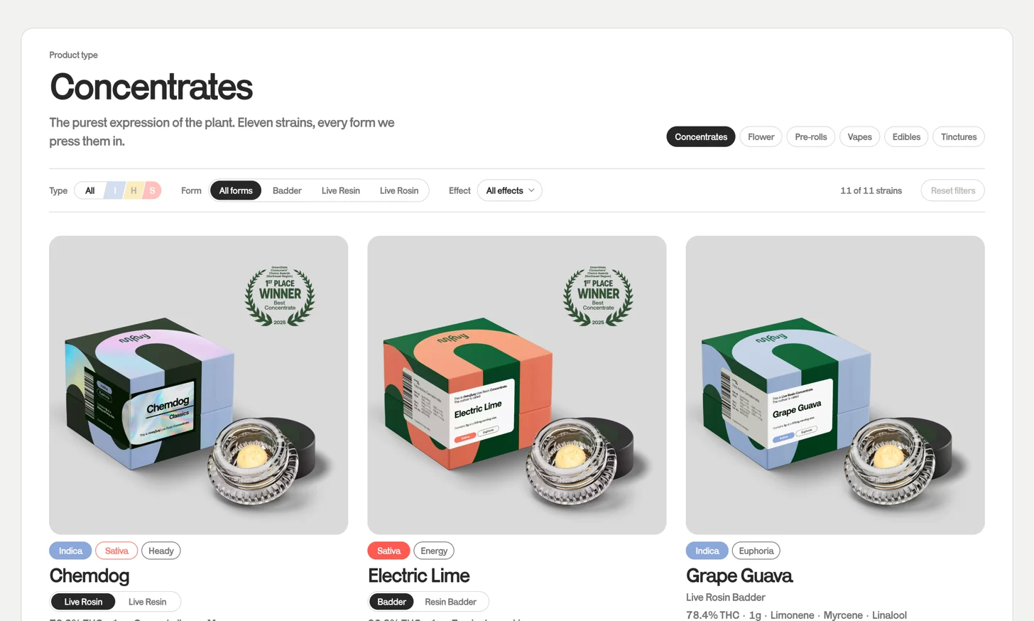
the concentrates page rendered one card per SKU, so a strain sold in two forms appeared twice in the grid as if the two were unrelated products. i made the card unit the strain instead of the SKU and moved form selection inside the card. eleven strains that were reading as thirteen products now read as eleven products with options.
at a glance
client. mfny (Marijuana Farms New York). self-directed, not commissioned.
surface. the /product-types/concentrates catalog page, desktop, 1440px.
the problem. 13 SKUs rendering as 13 cards for 11 strains.
the change. 11 strain cards, form selection moved inside the card.
delivered. working prototype, implementation spec, design tokens, component and interaction specs.
taxonomy. extraction (resin / rosin) split from texture (badder / concentrate)
THC values. placeholders. the live PDPs render that field empty.
what the page was doing
thirteen SKUs render as thirteen cards for eleven strains, so the grid is longer than the catalog is. every strain that exists in more than one form appears more than once, adjacent, with the same photo treatment and nothing on either card explaining the relationship. chemdog is the clearest instance, sitting in the grid twice as live resin and live rosin, and electric lime does the same thing. they read as unrelated products that happen to share a name.
the titles are doing four jobs at once. "chemdog live resin concentrate 1g" packs the strain, the extraction method, the product category and the weight into one line, so the strain name, the only part a returning customer is scanning for, is seven characters of a thirty-eight character string. every title on the page has that shape.
and where a strain is split across cards, the type tags can contradict each other. chemdog is tagged Indica on one and Sativa on the other. i do not know which is correct. that is a data question for the team rather than a design one, but the shopper sees the contradiction, and it undermines the type tag everywhere else.
the category error
this is the real problem and it took a while to see. live resin and live rosin are extraction methods, solvent against solventless. badder is a texture, what happens to the extract after the purge. they are different axes.
the page presented badder, live resin and live rosin as three peer options, which is why the naming is inconsistent across SKUs: some cards say "badder", some say "live resin badder", some say "live resin concentrate", and from the outside there is no way to tell whether a "badder" is a resin badder or a rosin badder.
the fix is to filter on both axes and to always name both on the card. "live rosin badder" is unambiguous where "badder" was not.
why it costs money
live rosin is the premium, low-yield, high-cost product. on the current page it sits next to its own cheaper sibling, unlabeled, with no explanation of why it costs more. that is not a neutral layout. it steers customers toward the lower-margin SKU.
you cannot upsell solventless if the page never says what solventless is.
and the second form is effectively hidden. a shopper who stops reading at the first chemdog card was never told the rosin exists. that is a silent, uncounted loss on every session.
the reframe
one card is one strain. form is an attribute of the card, not a reason to make another card. everything after this followed from that sentence.
i built three working options rather than describing them, because the whole question was about interaction and a static frame cannot answer "does this feel like more work than the old page". switch inside the card; make form the page with a tab bar; or expand a card in place to compare.
the tab bar was the cheapest to build and the best SEO story, and i dropped it: picking a tab puts you back at one form per strain with the alternative demoted to a text link, which re-hides the exact thing this work exists to surface. expand-in-place compares beautifully but costs a click before it shows you anything and reflows the grid, and most strains here have one form. switching inside the card keeps the comparison one hover away and the layout still.
the tri-code filter
the type filter wanted four states and i did not want four more gray pills competing with the type tags on the cards below. the type colors are the strongest signal on the page and spending them twice in one viewport weakens both.
so it became one pill split on a thirteen degree diagonal, one segment per type, showing single letters at rest and easing open to whole words on hover. the selected segment stays open, so the pill reads as the current filter as well as the control for it.
the diagonal is doing work rather than decoration. a vertical split reads as separate buttons pushed together; the shear says this is one object with parts. thirteen degrees is steep enough to be unmistakably deliberate at a 26px pill and shallow enough that a one-character label still sits optically centered inside a sheared parallelogram. at forty-five the counter-shear makes the letter look like it is falling over.
making the second form impossible to miss
a strain whose forms differ in type carries a tag for each. the selected one fills and slides to the leftmost slot while the other stays outlined, both on the same curve, so switching forms visibly moves the type and you can watch the card change character. chemdog is the card where that reads hardest, because its two forms are the two contradicting tags from the old grid, now sitting on one card where they can be compared instead of stumbled across.
hover previews and click commits. hovering either the tag or the form pill swaps the photo, the THC, the terpenes and the switcher, and reverts on mouse-out. nothing commits until you click, which makes exploring the second form free. early on hover and click did the same thing and you could not rest the cursor near a card without changing it.
untouched cards also cycle their forms every 3.4 seconds, staggered so no two pulse together, and stop permanently the moment you hover or click that card. it is unapologetically a merchandising device: a passive shopper who never hovers still learns the second form exists. it stops on engagement because motion under an active cursor is interference.
filtered-out forms stay in place and go inert, struck through and not-allowed, rather than disappearing. an earlier version let you click a blocked option and quietly relaxed the filter for you. it demoed well and i liked it, and it fails on clarity: a control that looks half-available and then changes filter state you did not set is a magic trick. clear beats clever on a page where people are spending money.
what is still open
the THC percentages are invented. every live PDP renders that field empty, so there was no real lab data to use. they are flagged in the demo rather than hidden, and they would have to be replaced before this went anywhere near production.
type is encoded in hue with a text label as the fallback. the labels cover most cases, but i would validate against a deuteranopia simulation before calling it done.
the design is desktop-only by scope, and the hover-preview model has no mobile equivalent. on a phone the switcher becomes tap-to-commit and the idle cycle has to do more of the discovery work.
karrik ships with one weight here, so the whole hierarchy is carried by scale and color. with a bold cut i would take the strain names down a few pixels and let weight do that work instead.
how it would be judged
nothing here is a measured result. the page was never shipped, so the honest version of "did it work" is a list of what would have to be instrumented.
rosin attach rate, the share of concentrate orders containing a solventless SKU, is the primary one. this design exists to move it.
then form-switch rate on multi-form cards, split hover against click and cycled-into against self-initiated, which is what would tell me whether the idle cycle earns its complexity or just adds motion. grid to PDP click-through against the duplicated baseline. and filter abandonment, because if that moves the wrong way the inert treatment is reading as "out of stock" and the fix is copy, not behavior.
the prototype
you can open the working demo, opens in a new tab. the THC numbers in it are placeholders, and it says so.
next up is df2tm, or go back to product designs.